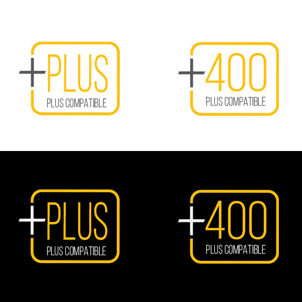
Logos and Icons

Throughout my career, I’ve developed, designed, and produced hundreds of logos and brand marks, encompassing a range of applications, from corporate identities and product logos to icons and comprehensive visual systems. Each project begins with a deep understanding of the brand’s positioning, audience, and competitive landscape, enabling me to translate strategic objectives into a clear and distinctive visual language. My approach balances thoughtful design with business strategy, ensuring every identity not only captures attention but also communicates meaning and value.
 
Logos Icons

Logos

I developed a range of logos and brand identities spanning digital products, services, and content platforms. The Techscout Touch logo was designed for a mobile app targeting below-the-line production professionals. For LiteGear Creative Solutions, I created a service brand identity to support the launch of a new division, establishing a professional visual system. LiteGear Live involved branding a podcast series focused on interviews with motion picture professionals, requiring a specific identity. For Spectrum OS2, I designed a logo and brand system for light control software with a clean, modern aesthetic suited for a software interface.

Software: Adobe Illustrator, Adobe Photoshop

I developed a range of logos and brand identities for Studio Depot, exploring both legacy-driven and contemporary design directions. The primary Studio Depot mark builds on the brand’s heritage, featuring a bold, dimensional red oval. A secondary iteration presents a more classic script typography and an “Est. 1927” designation to emphasize legacy and tradition. In parallel, I created modernized brand explorations, a streamlined “sdx” mark and a stylized “SXD” monogram, designed to introduce a more contemporary, scalable identity system suited for digital, product, and sub-brand applications. Together, these explorations supports the brand’s history and its forward-looking positioning.

Software: Adobe Illustrator, Adobe Photoshop

I developed a series of logos and brand marks for multiple LED studio lighting products and systems, including Mole LED and Varifocus Par. For Mole LED, I created a product logo designed for versatility across applications, with a white-background version optimized for print materials and a black-background version intended for direct application on the product itself. In parallel, I designed the Mole LED brand mark to establish a cohesive identity for the broader product line. For Varifocus Par, I explored two distinct design iterations for a line of bi-color LED studio lights, refining the visual direction to balance technical precision with strong brand presence.

Software: Adobe Illustrator, Adobe Photoshop

I developed a range of logos and brand identities spanning commemorative marks, sustainability initiatives, and advanced lighting technologies. The CIMA 20th Anniversary logo was designed as a celebratory emblem conveying prestige and legacy. For Mole-Richardson Green, I created a sustainability-focused identity symbolizing environmental responsibility. The Quantum Dot Technology mark explored a vibrant, spectrum-based visual system to reflect advanced color science and cutting-edge technology. For the 85th Anniversary logo, I developed a refined, medallion-style mark that balances heritage and longevity in the motion picture lighting industry.
 

Software: Adobe Illustrator, Adobe Photoshop

II developed a range of logos and brand identities, including mobile applications, content platforms, software interfaces, and advanced lighting technologies. The mobile app icon was designed with a bold, minimal form to ensure instant recognition and clarity at small sizes. For LiteGear Live, I created a podcast brand identity centered on a stylized microphone and halo motif. The Spectrum OS 3.0 identity was developed for lighting control software, incorporating a vibrant, full-spectrum gradient. For Spacelite, I designed a brand system that bridges aerospace-inspired innovation with lighting technology, using a rocket-integrated wordmark and a refined secondary mark.
 

Software: Adobe Illustrator, Adobe Photoshop

I developed a series of logo concepts for LiteGear Labs, each exploring variations on a core visual idea that combines scientific experimentation with mechanical precision, while drawing directly from the established design language of the LiteGear master brand. Centered around a gear form and laboratory flask motif, each option uses simplified geometry, bold line work, and the signature black, white, and yellow palette to maintain brand continuity while introducing a distinct identity for the Labs division. Across all options, I refined proportion, contrast, and iconography to balance technical credibility with visual impact, ultimately creating a flexible system that aligns with LiteGear’s innovation-driven ethos while clearly differentiating the experimental and R&D-focused nature of LiteGear Labs.
 
Software: Adobe Illustrator, Adobe Photoshop

Icons

A cohesive, modern icon system that uses bold, minimal linework, high-contrast black backgrounds for web and light backgrounds for mobile, and strategic yellow accents to clearly differentiate functionality while maintaining a unified, intuitive visual language across platforms
 
Software: Adobe Illustrator

IThe icon system establishes a bold, modular design language built around a dimensional, interlocking cube form that visually conveys compatibility, system integration, and product ecosystem cohesion. Using a consistent isometric structure with beveled geometry and subtle shading, each mark feels engineered and precise, reinforcing a sense of technical reliability and product sophistication. Color plays a critical functional role, with distinct, high-saturation hues (yellow, blue, and red) acting as immediate visual identifiers for compatibility tiers. The clean, uppercase typography and structured lockups ensure clarity across both light and dark environments.

Software: Adobe Illustrator

A clean, modular badge system that uses a refined typographic hierarchy, rounded corner frames, and a restrained yellow–black palette to clearly signal product compatibility, with scalable variants “PLUS” and “+400” designed for quick recognition across light and dark environments while maintaining strong brand consistency and legibility.
 

Software: Adobe Illustrator

A cohesive, UI-driven icon system that employs bold, high-contrast linework and consistent stroke weights within rounded container frames to create a unified visual language, while intuitive color-coded accents, such as yellow for interaction, green for positive states, and red for removal or restriction, enhance hierarchy and usability, enabling users to quickly interpret actions, system states, and feedback with clarity, consistency, and immediate visual recognition across digital touchpoints.
 
Software: Adobe Illustrator